Wednesday, 30 September 2015
Invisible Cities: Baucis
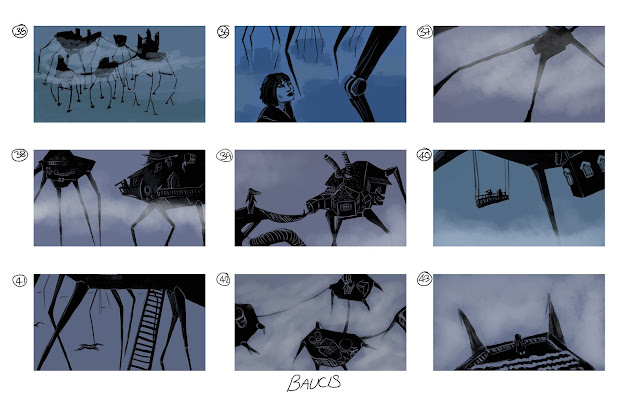
When reading about Baucis, I imagined the city as a tangled mess of machines and houses, with pipes protruding on the outside and parts of slate rooftops looking as though they were crudely stuck on the sides of these monstrosities with glue. I wanted the stilts the city stands on to look mechanical, as though they were once moving, but the weight of the city and it's inhabitants is now too much, and the city remains hovering in the clouds, continuing to grow despite the fragility of the legs it stands on. The inhabitants spy on the ground from balconies and lifts (40) that lower them below the line of clouds disrupting their view.
Film Review: Metropolis (1927)
 |
| Fig. 1: Original Theatrical Release Poster (1927) |
Fritz Lang's Metropolis (1927) is set in a futuristic
dystopian city that shows dramatically the disparity between those that live in
and enjoy the city, and the workers who keep the city going. ""Metropolis" (1927) fixed for the rest of the
century the image of a futuristic city as a hell of scientific progress and
human despair." (Ebert, 1998)
| Fig. 2: The machine in reality. |
 |
| Fig. 3: The machine as Freder sees it, consuming slaves. |
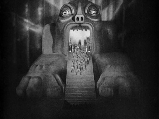
The film contains masses of imagery. When there is
an explosion at one of the machines (Fig. 2), Freder sees the machine
transform into a monster (Fig. 3); in it's mouth, the churning metal
parts of the machine can be seen, ready to consume the workers who walk into it
in large groups. This idea of the workers being food for the machines is later
reinforced by the Machine-Man who cries "Who is the living food for the
machines in Metropolis -?! Who lubricates the machine joints with their own
blood -?! Who feeds the machines with their own flesh -?!". There is
no question about it, Metropolis is a city built on blood and
bones, something represented by the network of catacombs that lie beneath the
city, completely ignored by the people above, much like the worker city, where
people die but no one hears about it, not even Joh Fredersen, the Master of
Metropolis.
Metropolis shows "a future where an exploited
underclass works in subterranean machine halls to support a small, pampered
aristocracy" (French, 2015). It is representative even of society
today, where so many work in order to keep things moving, while very few do
not, yet live better. It is worth noting, that even when the workers destroy
the machines in order to fight back, it is they who suffer. Their homes are
destroyed in a flood -- one which they believe their children died in too --
while those on the surface enjoy themselves, blissfully ignorant of what is
happening below them.
 |
| Fig. 4: Machine-Man compared to C-3PO |
It is clear from watching Metropolis how the film inspires stories and
character designs to this day. The Machine-Man looks like it could be an
early prototype of C-3PO from Star Wars (1977), the design for the city and
overall story is very similar to the setting in the game BioShock (2007), which is set in an underwater,
dystopian, art deco style city that has been left in ruins after an uprising.
Stories of dystopian cities/towns disguised as utopias have become fairly
common in modern media, to the point where it's almost boring. Watching Metropolis, however, brings
back some of the thrill of watching a city destroyed by its abused
underclass.
 |
| Fig. 5: Fredersen, Rotwang and the Machine-Man |
There is something inspiring about watching a film that paved the way for so many other films, shows, games and books. The world of Metropolis is intriguing and eccentric, yet believable as it represents our own cities and our own culture. It is not hard to imagine Metropolis existing today.
Images:
Figure 1. Original Theatrical Release Poster (1927) Metropolis. [Advertisement] At: https://en.wikipedia.org/wiki/Metropolis_(1927_film) (Accessed on 29.09.15)
Figure 2. Film Still (1927) From: Metropolis. Directed by Fritz Lang. [Film Still]. Germany: Babelsberg Studios. At: http://floatingcinema.info/events/2015/open-air-weekender_humans-in-space-day2 (Accessed on 30.09.15)
Figure 3. Film Still (1927) From: Metropolis. Directed by Fritz Lang. [Film Still]. Germany: Babelsberg Studios. At: https://cinema1544.wordpress.com/cinema-1544/metropolis/ (Accessed on 30.09.15)
Figure 4. Machine-Man Compared to C-3PO. [Image] At: http://starwarsmodern.blogspot.co.uk/2012/11/thoughts-on-episode-vii-learning-from.html (Accessed on 30.09.15)
Figure 5. Film Still (1927) From: Metropolis. Directed by Fritz Lang. [Film Still]. Germany: Babelsberg Studios. At: http://www.datuopinion.com/rotwang (Accessed on 30.09.15)
Bibliography:
Ebert, Roger. (1998) 'Metropolis'. At: http://www.rogerebert.com/reviews/great-movie-metropolis-1927 (Accessed on 29.09.15)
French, Philip. (2015) 'Metropolis review -- Philip French on Fritz Lang's visionary epic'. In: The Guardian [Online] At: http://www.theguardian.com/film/2015/mar/15/metropolis-fritz-lang-philip-french-classic-dvd (Accessed on 29.09.15)
Tuesday, 29 September 2015
Monday, 28 September 2015
Digital Painting: Abstracts
These abstracts I did in class today were inspired by the city Ocatvia. Doing the abstracts was useful for generating ideas, and I plan to use a similar colour scheme when I do the thumbnails for this city.
Maya Tutorial: Ray Gun
I think I'm getting the hang of Maya now, and a few people have been kind enough to help me with some things. I'm very happy with my ray gun.
Sunday, 27 September 2015
Maya Tutorial 1: Egg Cups
To say I struggled with this tutorial would be an understatement, but I pushed through and eventually managed it. I can honestly say I feel slightly more confident using Maya now, and will attempt the next tutorial as soon as possible.
Invisible Cities: Phyllis
I did these sketches of how I imagine Phyllis to look using pencil and watercolours. I of course looked to Venice for inspiration for the houses and canals, then tried to make the city a jumbled mess of houses, canals, bridges and balconies. For number 28, I tried to draw it from the perspective of someone gazing up at the houses from the canals, and the houses hovering over them. I'm still trying to remind myself to "zoom out" more, so I'm able to put more of each city in each thumbnail.
Saturday, 26 September 2015
Invisible Cities: Fedora
I wanted to draw Fedora as a dull, grey city, with only the metal building holding any kind of colour or intrigue. I had more ideas for the interior of the museum than the city itself, and thought about how the crystal globes would be on display. Some on square blocks (19 and 22), some suspended from the ceiling (24) so the visitors have to look up, some several times the size of others (26) in large rooms where hundreds of people can come and gaze at it all at once, and some small enough to be held up, to compare to Fedora (23).
Friday, 25 September 2015
Invisible Cities: Argia
For Argia, I decided to use brown, black and orange to create my thumbnails. I wanted to show a partially destroyed city, perhaps nearly deserted. Thumbnail 13 shows people escaping their underground life over the over-sized roots that -- like in thumbnail 17 -- are destroying their homes.
Inspiration: The Tales from Dunwall
These short animations were released as prequels to the game Dishonored (2012), in order to give people some insight into the kind of world Dishonored was set in. I think they're beautifully animated, and I love how the small amounts of colour used (blue for whale oil, red for blood) really stick out against the black and white background.
Something else I find interesting, was the decision to have Chloë Grace Moretz, who voices 10 year old Emily Kaldwin in the game, narrate the animations. The idea of a child telling these somewhat morbid stories, as though they are typical of a child's bedtime story, makes the animations even more eerie.
Something else I find interesting, was the decision to have Chloë Grace Moretz, who voices 10 year old Emily Kaldwin in the game, narrate the animations. The idea of a child telling these somewhat morbid stories, as though they are typical of a child's bedtime story, makes the animations even more eerie.
Invisible Cities: Anastasia
For Anastasia, I mainly focussed on the pools and canals. Thumbnail 8 is a rough idea of what the city would look like from a bird's-eye view, with a small section for the pools and market surrounded by canals - kind of like a prison surrounded by water. I wanted the city to seem quite beautiful from the ground, but dark and oppressive from above, something the people walking around the city wouldn't notice. I also had the idea to incorporate the various gems and stones mentioned into the description of the city, into the buildings (seen in thumbnails 1, 7 and 9). The gems are visible just above the water line, where fewer and fewer of them are built into the brick as the building gets taller, so the top is only dark bricks.
Tuesday, 22 September 2015
Invisible Cities: Influence Map
After reading over the descriptions for the cities, I have created my first influence map, which will help me when creating thumbnails for the cities. Though I am already leaning towards some cities more than others in terms of ideas, I intend to do at least a page of thumbnails for each one.
Film Review - Das Cabinet des Dr. Caligari (1920)
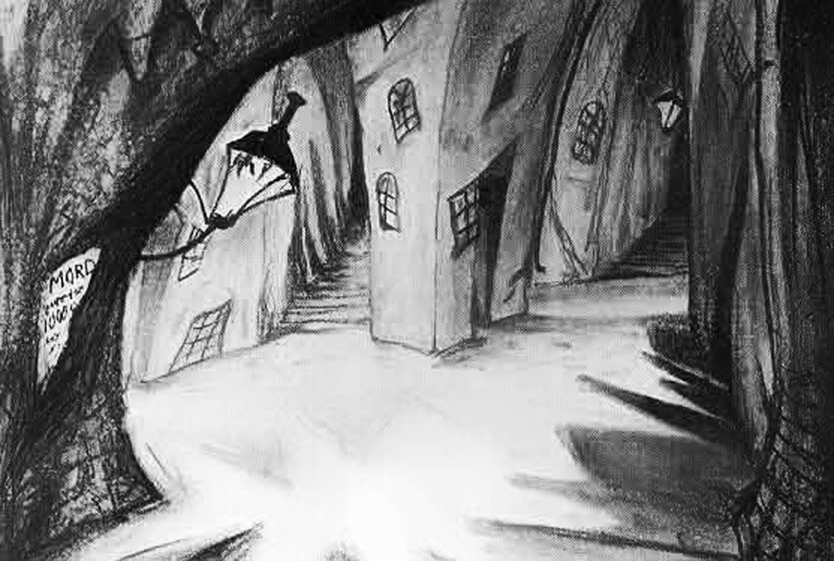
Robert Wiene's Das Cabinet des Dr. Caligari (1920) is an interesting and dark tale set in the town of Holstenwall, which is brought to life on an elaborate and bizarre looking set, the appearance of which brings to mind the imaginative drawings of Dr Seuss, with its zigzagging streets and block-like buildings that go up in every direction, all similar in style, but no two exactly the same.
 |
| Fig 1: Concept art for Holstenwall |
Das Cabinet des Dr. Caligari has been called "a mute opera of fear" (Bradshaw, 2014) and "arresting and provocative" (French, 2014). The unrealistic set, over the top acting and symbolism are what make the film so intriguing. It can be argued that, had the film been made at a later date, with new technology, it would not have received the same amount of praise as it has. If the film had been made in colour instead of black and white, it would not have the same atmosphere as it does. In black and white, the sets are full of dark corners, giving a sense of danger and fear of what may be lurking in the shadows. Even the silence adds to the film, as the audience can only witness the violence of Alan's death, not hear it. The acting may be bold, and sometimes seem a little silly, but the actors do a fantastic job of showing their feelings through expression and movement rather than words. The heavy use of makeup gives their eyes more expression, and looks of astonishment, wonder and fear are far more clear.
| Fig 2: The jagged streets and buildings of Holstenwall. |
Das Cabinet des Dr. Caligari is believed to have "lay down a template for today's scary movies, noirs and psychological thrillers." (Bradshaw, 2014). Watching the film, the audience may notice scenes and tropes they are used to from more modern films. Things such as the silhouette of the murderer at the window, or the shadow of a threatening figure looming over its victim, are all used in modern films and TV shows to create a threatening atmosphere, and can be seen in Das Cabinet des Dr. Caligari. It is very clear how this film inspired future filmmakers.
A common trope that appears in this film is the image of a large, dark and (on occasion) dangerous character carrying a "damsel in distress". This is seen in more modern films such as King Kong (1933) and is often used in superhero comics.
| Fig 3: Cesare flees with Jane. |
Images:
Fig 1. Concept art for Holstenwall [Concept art] At: https://one1more2time3.wordpress.com/tag/live-action/ (Accessed on 22.09.15)
Fig 2. The jagged streets and buildings of Holstenwall (1920) From: Das Cabinet des Dr. Caligari. Directed by: Robert Wiene. [Film still] Germany: Decla-Bioscop AG. At: http://wallpapers2015.mobi/the-cabinet-of-dr-caligari-wallpapers/ (Accessed on 22.09.15)
Fig 3. Cesare flees with Jane (1920) From: Das Cabinet des Dr. Caligari. Directed by: Robert Wiene. [Film still] Germany: Decla-Bioscop AG. At: http://wallpapers2015.mobi/the-cabinet-of-dr-caligari-wallpapers/ (Accessed on 22.09.15)
Bibliography:
Bradshaw, Peter. (2014) "The Cabinet of Dr Caligari review - occult scary-movie touchstone from 1920" In: theguardian.com 28.08.14 [online] At: http://www.theguardian.com/film/2014/aug/28/the-cabinet-of-dr-caligari-film-review (Accessed on 22.09.15)
French, Philip. (2014) "The Cabinet of Dr Caligari review - Philip French on one of cinema's first masterpieces" In: theguardian.com 05.10.14 [online] At: http://www.theguardian.com/film/2014/oct/05/cabinet-of-dr-caligari-dvd-review-classic-french (Accessed on 22.09.15)
Monday, 21 September 2015
Digital Painting
I am very happy with the paintings I produced in this class, though they are simple and quick. They were fun to do, and I plan to do more quick practice paintings in the future in order to improve and produce more work.
Thursday, 17 September 2015
Summer Project Progress 5
I'm going to start work on my turnarounds tonight, but these are the last few sketches I've done for the project. I would still like to complete it, as it has been useful for getting myself back into drawing regularly and using my imagination.
Summer Project Progress 4
I'm mostly still drawing life forms, but many of them could be adapted into machines if I set my mind to it. As for structures, I am still struggling to create them, but will try to focus on drawing more of them today. My favourites out of these drawings are 41 and 51, and I will most likely develop one of these when I finish the project.
Subscribe to:
Comments (Atom)


