| Fig. 1: Original Theatrical Poster (1968) |
The 1960s were an important time in America's space program, the decade began with the "space race" and rocket testing, and ended with two successful moon landings. Stanley Kubrick's 2001: A Space Odyssey, looks into human evolution, existentialism and artificial intelligence, on a futuristic set (fig. 2) that shows otherworldly technology and architecture. Despite these interesting themes, a stunning set and excellent visual effects, the film received mixed reviews: "The overnight Hollywood judgement was that Kubrick had become derailed, that in his obsession with effects and set pieces, he had failed to make a movie. What he had actually done was make a philosophical statement about man's place in the universe" (Ebert, 1997).
| Fig. 2: Futuristic Seating Area. |
Despite the excitement about space travel people had in the 60s, Kubrick's take on it is very dark. At the beginning of the film, none of the characters seem excited about being in or working in space, instead, there is a sense that this is an every day routine; sometimes, you're on earth, but now and then your job might involve a conference on the moon. After encountering the monolith, the film takes a different turn. The Dawn of Man sequence at the beginning, and the films dramatic ending, suggest that through evolution we have gone too far and learned too much; the monolith was not intended to be found. The prehistoric apes encounter the monolith and discover they can use bones as tools. A scene shows a bone falling through the air and becoming a space shuttle, compressing all evolution and discovery made by man into a split second.
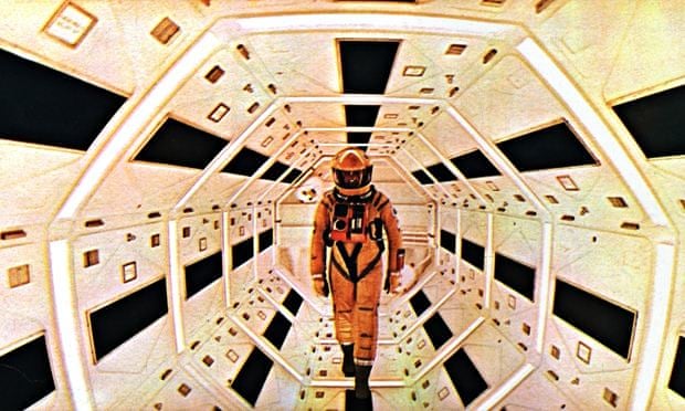
The set design was largely influenced by Kubrick, who wanted to involve himself in every aspect of production, even choosing the materials the actors costumes were made of. Much of the set is recognisable, made up of things that the audience would see in their daily lives; desks, chairs, tables, etc. However, all the objects are noticeably different and more "futuristic" looking, especially due to their placement in curved corridors with bright white, pristine paneling that only seems to fit the aesthetic of a space ship. "The Cinerama projection takes a bit of adjusting to, the curved look of tables and other squarish objects being a bit unreal but this passes as one becomes involved in the fantastic settings." (Frederick, 1968).

"The tremendous centrifuge which makes up the principal set (in which the two astronauts live and travel)" (fig. 5) "reportedly cost $750,000 and looks every bit of it, being one of the most unusual sets ever dreamed up for a film." (Frederick, 1968).
2001 has very little dialogue, barely any plot, and the majority of the film is told visually. All the dialogue is during the middle of the film, as there is none during the opening sequence and none after HAL's "death". Many of the characters seem disconnected from each other, and relationships between them are not clear. Despite living together, Dave seems to have a stronger bond with HAL than he does his co-worker, Frank. In fact, the relationships between HAL, Dave and Frank are the only clear ones in the entire film. Frank is quick to assume HAL has malfunctioned, while Dave is not convinced. Dave is shown having longer conversations with HAL, while Frank says very little to either of them. Even in the introduction to these characters, Dave and Frank seem to barely acknowledge each other, their role is explained through a TV interview they're watching of themselves. Does this only apply to these few people in Kubrick's envisioning of life in 2001, or was this his prediction of how disconnected people would be in a future involving space travel and sentient machines? Evidence for the latter is also shown near the beginning of the film, when Dr. Heywood Floyd contacts his daughter to inform her he won't make it for her birthday. He does not seem the slightest bit upset by this, in fact, judging by the tone of both characters, it would be easy to assume this had happened before. One of very few scenes where real emotion seems to be shown is when HAL is shut down; despite HAL's monotonous voice, they sound genuinely scared of being switched off, pleading with Dave and trying to convince him that they have seen the error of their ways; "I know I've made some very poor decisions recently, but I can give you my complete assurance that my work will be back to normal. I've still got the greatest enthusiasm and confidence in the mission. And I want to help you." "I'm afraid. I'm afraid, Dave. Dave, my mind is going. I can feel it. I can feel it. My mind is going. There is no question about it. I can feel it. I can feel it. I can feel it. I'm a... fraid."
The world Kubrick created for 2001 is fascinating if the audience is willing to pay attention to it. Even the long, drawn out scenes are the way they are for a reason, as each one contains vital information or minor details that add so much to the story. Even when it feels like nothing is going on, the set design is intriguing to study. Kubrick's visions of the future were beautiful, and frightening
 |
| Fig. 3: The Monolith. |

| Fig. 4 and 5: Examples of set design. |
2001 has very little dialogue, barely any plot, and the majority of the film is told visually. All the dialogue is during the middle of the film, as there is none during the opening sequence and none after HAL's "death". Many of the characters seem disconnected from each other, and relationships between them are not clear. Despite living together, Dave seems to have a stronger bond with HAL than he does his co-worker, Frank. In fact, the relationships between HAL, Dave and Frank are the only clear ones in the entire film. Frank is quick to assume HAL has malfunctioned, while Dave is not convinced. Dave is shown having longer conversations with HAL, while Frank says very little to either of them. Even in the introduction to these characters, Dave and Frank seem to barely acknowledge each other, their role is explained through a TV interview they're watching of themselves. Does this only apply to these few people in Kubrick's envisioning of life in 2001, or was this his prediction of how disconnected people would be in a future involving space travel and sentient machines? Evidence for the latter is also shown near the beginning of the film, when Dr. Heywood Floyd contacts his daughter to inform her he won't make it for her birthday. He does not seem the slightest bit upset by this, in fact, judging by the tone of both characters, it would be easy to assume this had happened before. One of very few scenes where real emotion seems to be shown is when HAL is shut down; despite HAL's monotonous voice, they sound genuinely scared of being switched off, pleading with Dave and trying to convince him that they have seen the error of their ways; "I know I've made some very poor decisions recently, but I can give you my complete assurance that my work will be back to normal. I've still got the greatest enthusiasm and confidence in the mission. And I want to help you." "I'm afraid. I'm afraid, Dave. Dave, my mind is going. I can feel it. I can feel it. My mind is going. There is no question about it. I can feel it. I can feel it. I can feel it. I'm a... fraid."
| Fig. 6: HAL 9000. |
Images:
Figure 1. Original Theatrical Poster (1968) [Poster] At: http://www.colosoul.com.au/thearts/film/review-classic-2001-a-space-odyssey/ (Accessed on: 10.11.15)
Figure 2. Futuristic Seating Area (1968) From: 2001: A Space Odyssey. Directed by: Stanley Kubrick. [Film Still] United Kingdom: Metro-Goldwyn-Mayer. At: http://inktank.fi/17-little-know-facts-about-2001-a-space-odyssey/ (Accessed on: 13.11.15)
Figure 3. The Monolith (1968) From: 2001: A Space Odyssey. Directed by: Stanley Kubrick. [Film Still] United Kingdom: Metro-Goldwyn-Mayer. At: http://www.huffingtonpost.com/barry-kibrick/the-need-to-know_b_7869140.html (Accessed on: 13.11.15)
Figure 4. Examples of set design (1968) From: 2001: A Space Odyssey. Directed by: Stanley Kubrick. [Film Still] United Kingdom: Metro-Goldwyn-Mayer. At: http://www.theguardian.com/film/2014/nov/27/2001-a-space-odyssey-review-rerelease (Accessed on: 14.11.15)
Figure 5. Examples of set design (1968) From: 2001: A Space Odyssey. Directed by: Stanley Kubrick. [Film Still] United Kingdom: Metro-Goldwyn-Mayer. At: http://www.denofgeek.com/movies/24016/a-celebration-of-rotating-movie-sets (Accessed on: 14.11.15)
Figure 6. Hal 9000 (1968) From: 2001: A Space Odyssey. Directed by: Stanley Kubrick. [Film Still] United Kingdom: Metro-Goldwyn-Mayer. At: http://joeorman.shutterace.com/2001/2001HAL.html (Accessed on: 14.11.15)
Bibliography:
Ebert, R. (1997) '2001: A Space Odyssey' In: rogerebert.com 03.27.97 [online] At: http://www.rogerebert.com/reviews/great-movie-2001-a-space-odyssey-1968 (Accessed on: 14.11.15)
Frederick, R (1968) 'Review: '2001: A Space Odyssey'' In: variety.com 04.02.68 [online] At: http://variety.com/1968/film/reviews/2001-a-space-odyssey-1200421723/ (Accessed on: 14.11.15)

I really enjoyed this review, Eleanor. I too think there is a darkness to Kubrick's vision - a sense of dehumanisation and a chilly regard for emotions. This is a thoughtful critique.
ReplyDeleteYes, Eleanor... a very interesting review :)
ReplyDelete