
 |
| Intro to Spring-Heeled Jack |
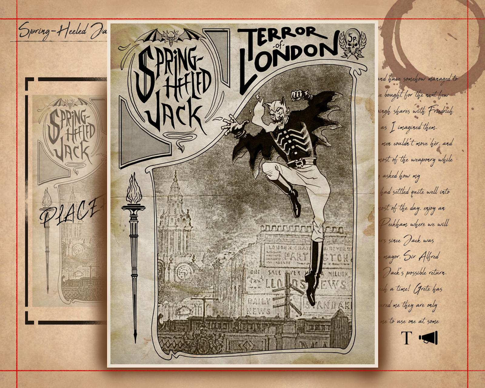

Most pages will have images that can be clicked on and enlarged. The placeholder image on this page would be a sketch Adelaide has done based on previous artists renditions of Jack. The "T" symbol opens a pop-up window that contains the info in an easier to read font. Clicking the megaphone will play audio of Adelaide reading the journal passage.
 |
| Easier reading. |

The pop-up will also have the megaphone symbol for audio, and can be closed when the reader is finished.
Things to work on:
- Journal - I feel Adelaide's journal needs major editting, and passages need to be re-read and reduced so they're not too long.
- Font - Whilst the Abuget font works great for the title, I'm worried it looks too messy/unintelligible in the journal. I will either have to find a different, more readable font.
 |
| Rough creature profile. |

This opens a window with easy to read stats, an audio option, and a "magnify" option that opens an interactive window, where the reader can look at a 3D model of the creature and how it moves in a simple environment. The creature will have a number of idle animations (standing, roar, attack) that the reader can cycle through.
I like the layout! And I like that the creatures will be animated in their descriptions and attributes windows :)
ReplyDeleteHey Eleanor - I like the whole 'easy read' version - because it means you can have the authenticity of the hand-written font. I don't think this font is 'too messy' - because if it was a bit 'less messy', it might look a bit naff - like a 'pretend' handwriting typeface of the worst kind.
ReplyDeleteHey - In essence the pages all seems logical and well thought out. I don't mind the choice of non-handwritten font either and the content seems fine too. If had to make one observation it is 'in the abstract' graphic layout and how your elements seem like they are slightly 'free-floating. Basically, the size (volume) and relative placement of things like the 'close page X', the placement of the audio button, the closeness of the text to the page scrolls, justification of the text (its left and could be justified both sides), how close things are to each other and the edge of the page, and how they are aligned with each other. A 'good' interface spends a lot of time getting that abstract stuff right and well balanced. Often it goes unnoticed because its not front and centre but its very important. My advice is to use an underlying grid to give your layout structure and a specific home for all of the elements. I realise this is just a mock-up but see below...
ReplyDeletehttps://login.filesanywhere.com/fs/v.aspx?v=8c69668d58606eb79c68
Thanks Alan! This is really helpful.
Delete